Los Angeles-based creative studio Imaginary Forces unveiled a retooled Marvel Studios logo when Thunderbolts* premiered in theaters this spring. On July 1, the movie debuted on digital platforms such as Prime Video, Apple TV Plus and Fandango at Home just in time for the long Fourth of July weekend.
Under the creative direction of Imaginary Forces’ Tosh Kodama, the logo pays homage to Marvel Studios’ comic book flip-intro but concludes with a new logo reveal that’s in sync with Thunderbolts’ darker, edgier tone.
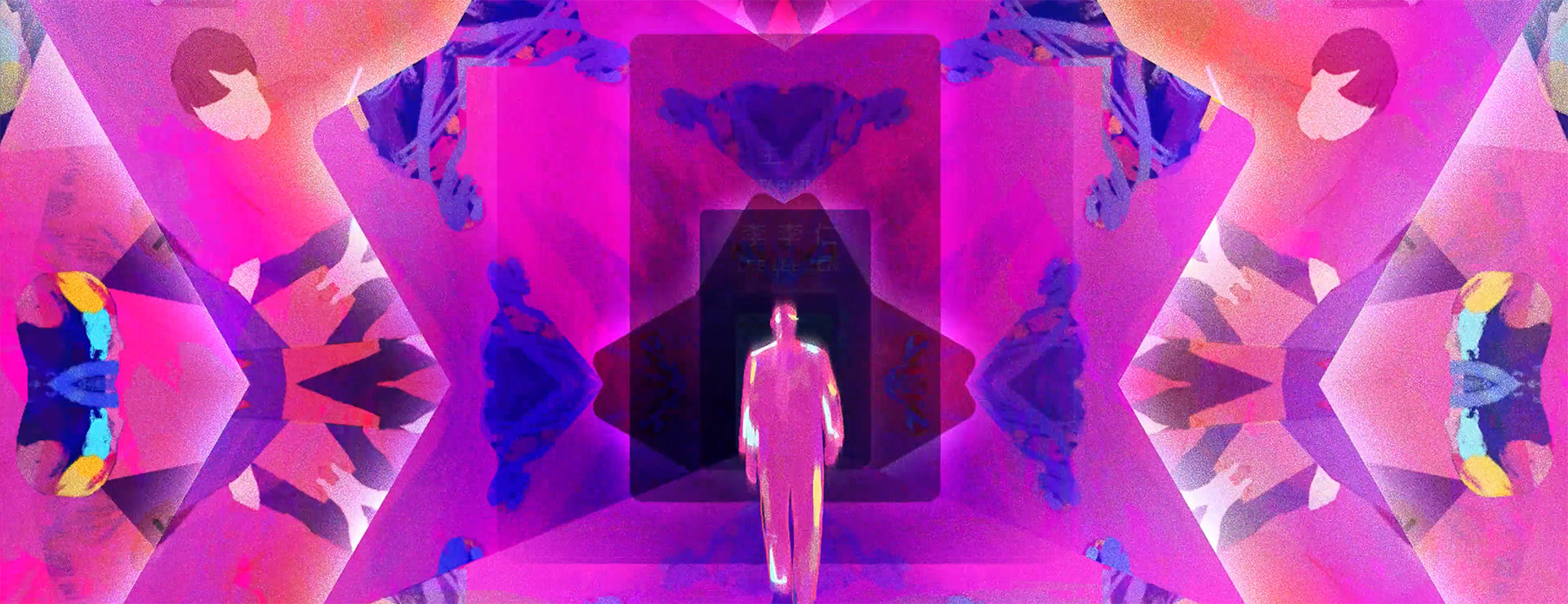
For the new motion logo, Kodama and the Imaginary Forces team built on Marvel’s classic comic-book flip concept—a staple of Marvel’s brand identity—but flooded it with darker hues as the graphic images sped by.
“The latest Marvel Studios logo builds on the rich creative history between Imaginary Forces and Marvel Studios,” said Kodama in a statement. “Our goal was to retain the iconic essence of the comic-book flip while pushing it into new visual territory within the Thunderbolts canon.”
RELATED: Imaginary Forces Draws Out 'Government Cheese' Main Titles
The lightning-fast sequence features thousands of comic-book images taken directly from the pages of Thunderbolts comics and projected onto a drifting 3D rendering of the Marvel wordmark. The camera pans in, around, and through the passageways of each letter. The logo is never fully revealed and eventually is coated in blackness — a foreshadowing of The Void, Sentry’s alter ego, and a key narrative element in the film.
“We wanted to create something truly epic and large-scale,” continued Kodama. “The sequence tells a story, albeit a subtle one, evoking the gritty, morally complex world of the Thunderbolts*. Aesthetically, it’s also a notable departure from the warm and vibrant hues of the previous logo animations, with the black slowly creeping in and overtaking everything, creating a sense of mystery and unease.”
To express The Void sonically, Imaginary Forces overlaid a haunting sound effect over Michael Giacchino’s well-known “Marvel Studios Fanfare.”
“Fans get jazzed the minute they hear the fanfare and they know it well,” adds Kodama. “So, sonically augmenting it was a simple but highly effective choice to subvert expectations and add intrigue.”
Imaginary Forces created its first Marvel logo animation for the 2002 release of Spider-Man that featured a stop-motion sequence of comic-book prints from Marvel’s archive. Ten years later, they again partnered with Marvel Studios, developing the logo’s next iteration: a stereoscopic 3D reimagining that premiered before Thor: The Dark World in 2012.
“Back in 2002, no one could have predicted Marvel would grow into the expansive Marvel Cinematic Universe we know today,” said Kodama. “We’ve been thrilled to collaborate with Marvel on the evolving logo animations over the years. Being part of the MCU’s next chapter is always an exciting and rewarding experience.”