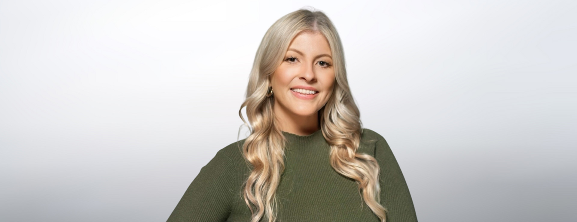
One of superhero maestro and DC Chief James Gunn’s unsung heroes is Chicago-based creative studio Sarofsky, led by owner, director and executive creative director Erin Sarofsky. The studio has worked with Gunn since he burst on the scene in 2014 with Marvel’s Guardians of the Galaxy and stayed with him through the entire Guardians franchise. Sarofsky continued to work with Gunn on Suicide Squad and Peacemaker after Gunn made the jump to Warner Bros. and DC.
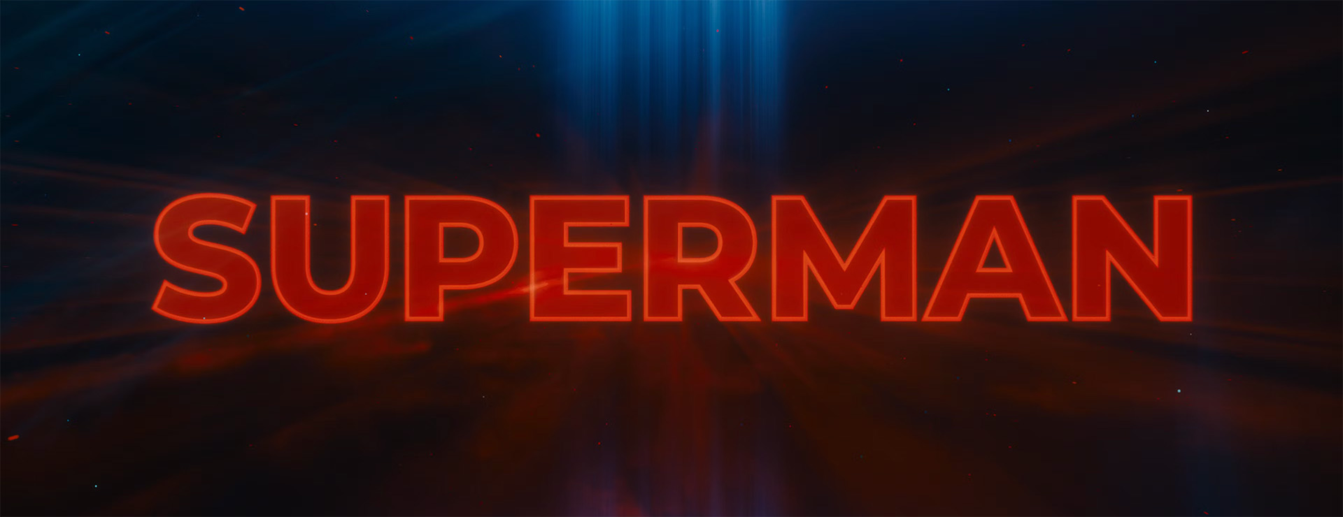
Most recently, Sarofsky collaborated with Gunn, DC Studios Co-CEO and Co-Chairman Peter Safran, and the DC team on 2025’s Superman, starring David Corenswet as the Man of Steel and Rachel Brosnahan as Lois Lane. Sarofsky produced the film’s main-on-end titles, which informed the look of the film’s marketing efforts, from trailer graphics to key art.
Spotlight chatted with Erin Sarofksy on how she and her team put it all together and why their continual collaboration with Gunn & Co. is so special to her.
Spotlight: What is your relationship with DC, and how did it come to be? What other projects have you done for DC and James Gunn?
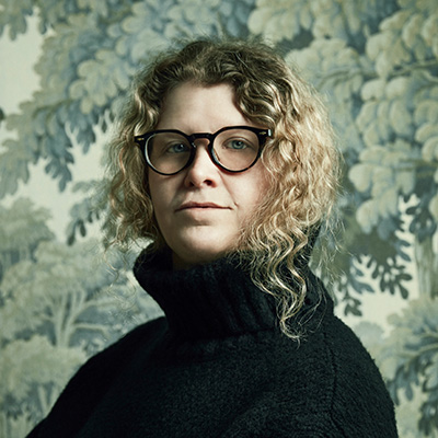
Sarofsky: We met James Gunn on the first Guardians of the Galaxy. We got to Marvel by way of the Russo brothers, and after we did Captain America: Winter Soldier with them, we got introduced to James as an option to do titles and work on Guardians. And it went really well. We did all four Guardians with him, and then he brought us in to work on Suicide Squad and Peacemaker. We’ve worked on every project he has personally directed since the first Guardians. Working so closely with him so often is something that I and everyone who works at Sarofsky is very proud of. He really, really, really cares about typography and design. I think you can see that in all of his visuals – from the composition to the costuming and the production design – he’s really a lover of design.
Spotlight: You guys also worked on ‘Fantastic Four: First Steps’ for Marvel, which also was a blockbuster hit this summer. Do you think that because you guys have done so much superhero work that people doing superhero movies tend to come to you?
Sarofsky: Definitely, we understand the genre very, very well. I think we also understand how to create a look for something that fits within a franchise. Whether it's Marvel or DC, you have a universe, but then you need to carve lanes within that universe for specific characters or specific groups of characters. You have to be big and embrace being bold while also staying somewhat commercial, because you need to create something that appeals to people with legacy feelings towards characters they've known and grown up with. But you also have to look for ways to modernize it and I think that's a hard thing to do. When you're working on something like Superman there's so much history there, you can't just turn it up to 11. As a designer, it's fun to go in and remake something from the ground up, but that would be totally the wrong thing to do for this franchise. It would be disingenuous to the fans.
Spotlight: What was the brief for Superman?
Sarofsky: I’ll never forget when James called and said, ‘I got one for you, Erin, it's Superman.’ We’ve worked on a lot together, and obviously Captain America was huge for me. From my childhood to my earliest days in motion design, it’s always been a touchstone. It goes as far back as when I was a junior designer at Digital Kitchen and I got to pitch on the film Superman Returns. That always felt like the one that got away.
When James explained what he was doing with the character and what the film was going to be, It seemed like we had to do something that felt like it was created by the sun, because that’s what fuels Superman.
We wanted the titles to feel like they were made of light, and that is also an homage to the original Greenberg brothers’ (Richard and Robert Greenberg who founded agency R/Greenberg Associates, now R/GA) main title for the 1978 Superman movie starring Christopher Reeves.
Spotlight: There have been quite a few Superman movies since then. Why did you feel it was important to pay homage to that one in particular?
Sarofsky: I think the brief aligned with it, with the idea that the type should be made of light. There's also that legacy feeling, there was something to it that we felt was important. I felt like it was honoring designers and title design and all of that. It also reset it back to that original tone, which felt like the right thing to do, and like it was aligning with what James wanted to do with his world.
Spotlight: Why do you think Superman continues to resonate so much with people? And how do you think you guys, if you think you did, try to tap into that resonance?
Sarofsky: I think there's a nostalgia to Superman that isn't necessarily there with any other superhero franchises. I think that nostalgia for us came in the form of Superman’s shield and the ‘S ‘ in the opening title sequence moment:
That’s also maybe a part of why we wanted to honor the Greenberg brothers’ title sequence, because we felt like we were more joining a legacy of torchbearers than creating a whole new thing. Superman is about doing good and being good and doing the right thing. I think that's what was really special about the film.
When we make title sequences, I and my whole team try to think about where the credits are actually going to go. We want it to be a total celebration of the key cast and craftspeople that made this. I think that truly honors the Superman legacy.
Spotlight: I always sit through all of the credits. One thing I always want to see are the music credits, and especially in a James Gunn movie. Your main-on-end titles are set to the Teddybears’ 'Punkrocker,' sung by Iggy Pop. Did you always know that song was going to be used and did you design in tandem with that?
Sarofsky: For as long as we were working on the main-on-end, it was set to that song.
Spotlight: Can you get into how you designed the lighting effects for this sequence? How did you envision the style you wanted and how did you get there in the end?
Sarofsky: We knew we wanted it rooted in what felt like real lighting. We filmed a lot of tests of projecting type and seeing what it looked like outlined, or looking at what the environment would have to be to actually make it read like a smoky room. We played with all these tests, and once we honed in on what was starting to work for us, we focused on making it something procedural, so that we would be able to easily change it if there were changes later on. If you are doing things practically in-camera, you have to have 100% certainty that things aren’t going to change, and the only thing that’s certain is that things are going to change. We knew however this sequence was going to be produced, it would have to be procedural.
After we did all of those tests, we focused on rebuilding what we wanted in a CG environment. You have to add little things that create aberrations in the moment. Once we started moving the camera around and putting in the aurora effects, for example, we started to build things out more and more because we don’t want to do the same exact thing over and over again. I think the R/GA title sequence holds up in some ways but in a modern context, it’s too long and it’s the same thing over and over again. We had to keep it moving.
Spotlight: You mentioned the aurora. I feel like the aurora is very associated with Superman because he has his headquarters in the Arctic and so forth. Is that what inspired including that effect in the sequence?
Sarofsky: Totally. We also explored, at one point, going from darkness through the atmosphere into light. The palette was an interesting thing because it is rooted in blues, reds and oranges with a little bit of yellow and gold hues. But we also wanted to pay homage to some of the other characters in the film, like Green Lantern, so you'll notice some of those hues come in at key points during the title sequence. It is still primarily a Superman-inspired palette, but we wanted to use those additional colors whether somebody notices that or not. I believe all these micro decisions impact the overall feeling.
Spotlight: In the moment from the opening sequence, why did you do the shield on Superman’s chest that evolves into lights and then becomes the actual title? What was the creative thinking behind doing that?
Sarofsky: We wanted to build up to where we were going with the main-on-ends. We wanted them to bookend each other. We knew we were doing this lighting effect with the title card sequence that would later flow into the main-on-ends.
Spotlight: Sarofsky also designed the captions. When you are doing that sort of work with James – selecting the font and the way the captions will be placed – is there a process to that and is it more complex than it looks?
Sarofsky: It's probably way more complex than it looks. It’s not wildly complicated but there are probably more rounds than you would ever expect because editorial is in flow so while they are cutting, we are testing. We’re inherently a step behind.
One thing I love is hearing audience feedback. It’s such a privilege to have some of those insights. Why wouldn’t you want to solve something that isn’t working for somebody?
Spotlight: That’s a very good growth mindset on your part, and it’s good that you don’t take feedback personally.
Sarofsky: When you're working on these things, you work on them for so long, and you can lose context. Designers get very up in our own heads about fonts or placement or this or that. So, it's great having editorial look at it, and James and the executives look at it. If it's not helping the story, and it's not helping legibility, that defies the whole point of that being there. It's not for us to be fancy designers, it's to convey a message.
Spotlight: I thought it was interesting that you wanted the main-on-end titles to look a little unpolished, but I was thinking that CGI sort of exists to make things look polished. I wondered how much work it was to make it look a little bit more like it was done in camera. Is it a lot of work to adjust so that the CGI can accomplish that?
Sarofsky: That’s something most people don't think about or talk about, but I think about and talk about all the time. When we film something, we are inherently noodling it in the flame like, let's dial that highlight down. You’re basically making it look more and more CG, until it's at the sweet spot where it's plausibly believable that it looked this perfect when you were filming it.
When you do something in CG, you're constantly doing the opposite. You're like, let's add a little bit more texture in there or a little bit of gradient over there, let's add some imperfections, or light glints or something that would happen more naturalistically, until you hit then that sweet spot of this could have plausibly been filmed. You're always engineering one way or the other. At least we are, because we always want something to feel cinematic, no matter how we did it. Cinematic, to me, is that there is always something somewhat naturalistic about the work, even if it was only done in CG.
It's just such a privilege to be able to work on this work and to be part of James’ team in the way that we are. Every time he calls, we just feel like it's magical, and like we're going to get to collaborate on something lots of people are going to see. Design is in an interesting place right now. In the world, there aren't many town squares left where everybody's seeing the same thing. Everybody's getting their algorithm that's geared towards them. So to be able to create something that people are going to see everywhere on the planet and have this collective experience around it is really special and it feels unbelievably amazing to be a part of that.

